Public Safety Analytics
Reading Road Safety Data Beyond the Headline
An analytical framework for moving from a casualty total to patterns across severity, location, road type, and environmental conditions.
A large total is a starting point, not a safety diagnosis
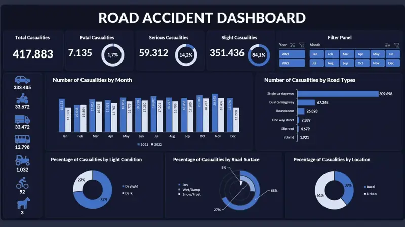
The road-safety dataset in this project represents 417,883 casualties, including 7,135 fatal casualties. It also shows that 61% of represented casualties occurred in urban areas.
These numbers communicate scale, severity, and distribution. They do not yet tell us which roads are riskier, why crashes occurred, or which intervention would prevent the most harm.
The analytical question is therefore: how can recorded casualties be organized into defensible priorities without claiming more than the data can support?
Clarify the unit of analysis
Road-safety datasets may contain crashes, vehicles, drivers, or casualties. These are different units:
- One crash can involve multiple vehicles.
- One vehicle can carry multiple people.
- One crash can produce several casualties with different severities.
If the dashboard counts casualty rows, the result should be labeled “casualties,” not “accidents.” Otherwise, a multi-casualty event could be interpreted as several separate crashes.
Before analysis, I would validate:
- Unique record identifiers
- Relationships between crash, vehicle, and casualty records
- Severity categories and missing values
- Date and time consistency
- Road-type and location classifications
- Duplicate or amended records
This distinction affects every KPI and must be documented in the data dictionary.
Put severity before frequency
Total casualties describe the size of the recorded burden, but severity changes the policy meaning. Fatal, serious, and slight casualties should be visible separately because an intervention that reduces severe outcomes may be valuable even if the total number of incidents changes slowly.
Two useful measures are:
Severity share = casualties in a severity category ÷ all casualties
Fatality share = fatal casualties ÷ all casualties
The fatality share in this dataset is approximately 1.7%. This does not measure the probability that a road user will die, because the dataset does not represent all exposure to travel. It only describes the composition of recorded casualties.
I would also avoid combining severity into an arbitrary score unless the weighting has a clear policy justification. A score can simplify ranking, but it may hide the actual number of fatal and serious outcomes.
Distribution is not the same as risk
The dashboard shows 61% of casualties in urban areas. A common mistake is to conclude that urban roads are therefore more dangerous.
That claim requires an exposure denominator. Urban areas may contain more residents, trips, intersections, pedestrians, vehicles, and recorded incidents. To estimate comparative risk, we would need measures such as:
- Vehicle-kilometers traveled
- Number of trips
- Traffic volume
- Population
- Road length
- Pedestrian or cyclist exposure
Without exposure, 61% should be described as the urban share of recorded casualties, not an urban risk rate.
Counts show where recorded harm is concentrated. Rates show harm relative to exposure. A responsible dashboard must not confuse the two.
Combine conditions carefully
Road type, lighting, surface condition, and location can help organize investigation. However, their categories often overlap with traffic volume and time.
For example, more casualties may occur in daylight because more travel happens during the day. Wet-road casualties may be fewer in total simply because wet conditions occur less often. A lower count does not automatically mean a safer condition.
I would examine:
- Casualty count and severity by road type
- Daylight versus darkness, separated by severity
- Dry versus wet surface conditions
- Urban and rural patterns
- Intersections or road geometry, if available
The strongest descriptive finding is usually an intersection of dimensions with sufficient volume—for example, a recurring concentration of severe casualties under a particular road and lighting combination. Even then, the result identifies a location for investigation rather than proving a cause.
Use time to distinguish pattern from anomaly
Monthly trends can reveal seasonality, unusual spikes, or structural changes. The first task is to check whether the pattern repeats across years.
A useful time review asks:
- Does the same month remain elevated in multiple years?
- Did the reporting process change?
- Were there unusual weather, mobility, or public events?
- Is the increase broad or concentrated in one severity or location group?
- Does the pattern persist after accounting for exposure?
A single spike may reflect a real safety problem, a reporting backlog, or random variation. A rolling average can make the underlying direction easier to see, while year-over-year comparison helps control for recurring seasons.
Filters should support these comparisons without encouraging users to select extremely narrow segments that produce unstable conclusions.
Prioritize with more than one dimension
Public-safety prioritization should balance at least four considerations:
- Severity: how serious are the outcomes?
- Volume: how many recorded casualties are involved?
- Persistence: does the pattern repeat over time?
- Actionability: is there an intervention that can be evaluated?
This produces a more useful priority matrix:
- High severity, high volume, persistent: immediate detailed investigation.
- High severity, low volume: case review and infrastructure assessment.
- Low severity, high volume: prevention and traffic-management opportunity.
- One-time spike: validate data and event context before intervention.
The purpose is not to produce an automatic ranking. It is to make the reasoning behind resource allocation visible.
Connect patterns to interventions
Different patterns imply different evidence needs:
- Nighttime severity may lead to lighting, visibility, speed, and enforcement review.
- Wet-surface patterns may lead to drainage, surface condition, tire, and speed analysis.
- Urban concentrations may require intersection, pedestrian, cyclist, and traffic-flow data.
- Rural severity may require response-time, speed, road geometry, and distance-to-care analysis.
- Repeated monthly peaks may require weather, travel-volume, or event data.
Each intervention should have a measurable before-and-after design. If an intersection receives improved lighting, track comparable periods, severity, traffic exposure, and nearby displacement rather than checking only whether the next month has fewer casualties.
Data quality and ethical communication
Road-safety data can be affected by under-reporting, inconsistent severity classification, boundary changes, missing coordinates, and differences in police or hospital recording. The most vulnerable road users may also be represented differently across systems.
The dashboard should clearly separate:
- Facts directly recorded in the dataset
- Patterns calculated from those records
- Hypotheses that require additional evidence
- Recommendations based on operational judgment
Language matters. “Casualties are concentrated under condition X” is defensible. “Condition X causes casualties” is not, unless the research design supports causal inference.
A stronger next version
The next iteration should add exposure measures, geographic coordinates, crash-level identifiers, speed environment, junction type, weather, vehicle type, and road-user category. Mapping severe-casualty clusters could then support site-level investigation.
Where exposure is available, the dashboard could compare casualty rates rather than only counts. Statistical uncertainty should also be shown for small areas or rare outcomes so decision-makers do not overreact to unstable rankings.
Final takeaway
The value of a road-safety dashboard is not the ability to display a large casualty total. Its value is the discipline to:
- identify the correct unit of analysis,
- separate frequency from severity,
- distinguish distribution from exposure-adjusted risk,
- test whether patterns persist,
- communicate uncertainty, and
- connect priorities to interventions that can be evaluated.
Responsible public-safety analysis makes the evidence easier to act on without making the evidence sound stronger than it is.