Workforce Analytics
Finding Attrition Patterns in Workforce Data
A practical walkthrough of turning employee records into focused retention questions, useful segments, and stakeholder-ready findings.
The real question is not “who left?”
An attrition dashboard can easily become a collection of demographic charts. That may describe the workforce, but it does not necessarily help HR make a better decision.
The more useful question is: where does attrition appear unusually concentrated, what evidence would explain it, and which response should HR test first?
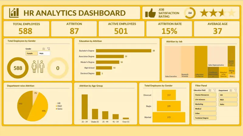
The dataset used in this project represents 588 employees. Eighty-seven records are associated with attrition, leaving 501 active employees and an overall attrition rate of approximately 15%. This is the organizational baseline. It tells us the scale of the outcome, but it is not yet a diagnosis.
Define the metric before building the chart
Attrition rate should be defined consistently:
Attrition rate = employees who left ÷ employees represented in the same population
The phrase “same population” matters. The numerator and denominator must share the same period, filters, employee definition, and level of detail. If the dataset contains repeated monthly records, counting rows instead of unique employees can inflate both the workforce total and the number of exits.
Before analysis, I would check:
- Whether employee identifiers are unique
- Whether attrition has one consistent definition
- Whether active and former employees are observed over comparable periods
- Whether blank values are missing information or valid categories
- Whether very small segments could produce unstable rates
This validation work is less visible than a dashboard, but it determines whether the dashboard deserves to be trusted.
Counts tell us workload; rates tell us concentration
Suppose Department A records 30 exits and Department B records 12. It is tempting to conclude that Department A has the larger problem. But if Department A has 300 employees while Department B has 50, their attrition rates are 10% and 24%.
Both measures remain useful:
- Attrition count estimates the operational scale of replacement and knowledge loss.
- Attrition rate shows how concentrated exits are within a group.
A decision-ready dashboard should display both. High count and high rate together indicate a different priority from high count caused primarily by a large workforce.
Segment with a hypothesis, not curiosity alone
I organized the analysis around dimensions that could support an HR follow-up:
- Department and job role
- Age group and career stage
- Education field
- Job satisfaction
- Other available employment characteristics
The goal is not to search every combination until an alarming number appears. Each segment should connect to a plausible operational question. If one job family shows an elevated rate, HR can investigate workload, manager practices, compensation, promotion paths, or hiring fit. The dashboard identifies where to ask; it does not provide the answer by itself.
Segment size must also remain visible. A 50% attrition rate among two employees is not equivalent to 25% among 200. For small groups, I would show the underlying count, flag the limited sample, and avoid ranking the result as if it were stable.
A segment becomes actionable when it combines a meaningful rate, sufficient volume, a credible business explanation, and an intervention the organization can actually test.
Read patterns through multiple lenses
A single breakdown can hide important context. Department differences may partly reflect different job mixes. Age patterns may overlap with tenure or seniority. Satisfaction may be measured after problems have already developed.
I therefore use a layered reading process:
- Compare each segment with the 15% organizational baseline.
- Check the number of employees behind the rate.
- Apply a second filter to see whether the pattern persists.
- Review whether the pattern is stable across time, if dates are available.
- List alternative explanations before recommending action.
This does not prove causality, but it reduces the chance of treating a surface-level correlation as a management conclusion.
Design the dashboard around a decision path
The dashboard begins with workforce size, active employees, attrition count, and attrition rate. These establish the baseline. The next layer compares departments, jobs, demographic groups, and satisfaction measures. Slicers allow stakeholders to test a pattern without rebuilding the analysis.
The intended reading path is:
- Orient: How large is attrition overall?
- Locate: Which groups differ from the baseline?
- Validate: Does the pattern remain after another relevant filter?
- Prioritize: Is the segment large and important enough to investigate?
- Act: What evidence and intervention should come next?
This structure keeps visual variety from becoming the organizing principle. Every chart has a role in the investigation.
Turn a pattern into an HR action
I would translate findings into an action matrix rather than a generic recommendation:
- High rate, high volume: prioritize root-cause research and a targeted retention experiment.
- High rate, low volume: investigate carefully, but communicate uncertainty.
- Low rate, high volume: monitor because even a normal rate can create substantial replacement cost.
- Low rate, low volume: keep visible without consuming immediate attention.
The follow-up depends on the suspected mechanism. Possible next evidence includes compensation benchmarks, manager changes, overtime, promotion history, employee surveys, exit interviews, and tenure at departure.
An intervention should also have a measurable outcome. For example, if HR pilots a manager coaching program, compare retention, satisfaction, and internal movement before and after the program while accounting for seasonality and workforce changes.
What this analysis cannot claim
The dashboard is descriptive. It cannot prove that age, department, satisfaction, or any other displayed characteristic caused an employee to leave. It may also exclude factors that matter most, such as external job offers, pay competitiveness, commute, leadership quality, or personal circumstances.
There are additional risks:
- The data may represent only one snapshot.
- Attrition may combine voluntary and involuntary exits.
- Satisfaction measures may be incomplete or collected at inconsistent times.
- Demographic segmentation can create privacy and fairness concerns.
- Historical patterns may not continue after organizational changes.
These limitations should appear in the analysis, not remain hidden in technical notes.
A stronger next version
The next iteration should separate voluntary from involuntary attrition, add tenure and exit dates, connect compensation and promotion history, and track rates over time. With sufficient longitudinal data, HR could move from a static description toward early-warning analysis.
Even then, prediction should not become automatic judgment. A model can help allocate investigative attention, but employment decisions require transparency, fairness review, and human context.
Final takeaway
Valuable workforce analytics does not stop at identifying the group with the highest bar. It builds a reliable baseline, balances counts with rates, tests patterns across relevant dimensions, communicates uncertainty, and connects each finding to evidence HR can collect and an intervention it can evaluate.
The dashboard is not the decision. It is a disciplined way to reach a better one.